

Step-by-step Subscription Process form HTML CSS and JavaScript
Master the process of building a sleek step-by-step subscription process form with front-end web technologies(HTML CSS & JavaScript). Collecting leads through subscription forms is highly effective, but adding a step-by-step design creates more user-friendly experience for visitors..
This guide will walk you through building a responsive step-by-step subscription form that delivers a smoother user experience and better conversation performance.
- HTML CODE
To start building the form, we need a basic HTML structure that organizes all the essential elements. Here’s a closer look at the HTML code.
Inside the container, the form content is organized to create a smooth and engaging user experience. The heading and description introduce the subscription form while explaining the benefits of joining the community. A progress bar is included to visually guide users through the three-step process, with the active class highlighting the current stage of completion. Additionally, a loader element is provided to display loading animations or transitions, typically controlled through JavaScript or GSAP for enhanced interactivity.
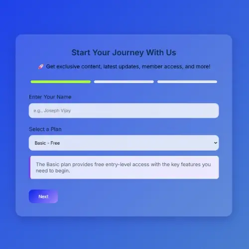
- Step 1 is the default visible section, activated using the active class, and includes input fields for the user’s full name and plan selection through a dropdown menu, along with a navigation button to continue.
- Step 2 remains hidden initially and appears when the user clicks “Next” from the first step; it contains an email input field with built-in HTML5 validation and navigation buttons for moving forward or backward between steps.
- Step 3 serves as the final confirmation screen, displaying a thank-you message after successful form completion, while also providing a back button that allows users to return and edit their email information if needed.
<!DOCTYPE html>
<html lang="en">
<head>
  <meta charset="UTF-8" />
  <meta name="viewport" content="width=device-width, initial-scale=1.0" />
  <title>Guided Subsription Process</title>
  <link href="https://fonts.googleapis.com/css2?family=Inter:wght@400;600&display=swap" rel="stylesheet" />
  <script src="https://cdnjs.cloudflare.com/ajax/libs/gsap/3.12.2/gsap.min.js"></script>
  <link rel="stylesheet" href="styles.css">
</head>
<body>
  <div class="container">
    <h2>Start Your Journey With Us</h2>
    <p class="benefits">
      🚀 Get exclusive content, latest updates, member access, and more!
    </p>
    <div class="progress-bar">
      <span id="bar1" class="active"></span>
      <span id="bar2"></span>
      <span id="bar3"></span>
    </div>
    <div class="loader" id="loader"></div>

    <div class="step active" id="step1">
      <div class="form-group">
        <label for="name">Enter Your Name</label>
        <input type="text" id="name" placeholder="e.g., Joseph Vijay" />
      </div>
      <div class="form-group">
        <label for="plan">Select a Plan</label>
        <select id="plan" onchange="planInfo()">
          <option value="basic">Basic - Free</option>
          <option value="pro">Pro - $5.99/mo</option>
          <option value="premium">Premium - $11.99/mo</option>
        </select>
        <p id="plan-info" class="plan-info"></p>
      </div>
      <div class="buttons">
        <button onclick="nextStep(1)">Next</button>
      </div>
    </div>

    <div class="step" id="step2">
      <div class="form-group">
        <label for="email">Email Address</label>
        <input type="email" id="email" placeholder="e.g., john@example.com" />
      </div>
      <div class="buttons">
        <button onclick="prevStep(2)">Back</button>
        <button onclick="nextStep(2)">Next</button>
      </div>
    </div>

    <div class="step" id="step3">
      <div class="thank-you">
        <p>🎉 Thanks for Connecting With Us!</p>
        <p>You’re officially part of the community — expect an email from us shortly.</p>
      </div>
      <div class="buttons">
        <button onclick="prevStep(3)">Back</button>
      </div>
    </div>
  </div>

  <script src="script.js"></script>
</body>
</html>- CSS CODE
With the HTML structure completed, it’s time to apply CSS styling to create a clean and modern form design. Below is a detailed explanation of the code.
The universal selector (*) applies consistent styling across all elements by resetting default margins and padding while setting the global font to Inter. Using box-sizing: border-box ensures that padding and borders are included within an element’s total width and height for easier layout control.
The body styling centres all content both horizontally and vertically while occupying the full viewport height (100vh) for a balanced layout. A soft blueish gradient background is applied and animated using `gradientShift`, creating a smooth and visually engaging moving gradient effect.
The .progress-bar creates a horizontal arrangement of progress indicators, evenly distributing each step across the form for clear visual guidance. Each .progress-bar span represents an individual step and is displayed with a light blue color by default. When a step becomes active, the .active class applies a vibrant color gradent, making the current stage stand out and helping users track their progress through the form.
The .loader class represents a circular loading indicator that remains hidden until needed. It is perfectly centred on the screen using transform: translate(-50%, -50%), ensuring consistent positioning across different screen sizes. A spinning effect is applied through the @keyframes spin animation, providing users with visual feedback during loading or transition states. The @keyframes spin animation creates a continuous rotation effect, causing the loader to spin smoothly in a complete 360-degree circle.
The h2 heading and .benefits are centered to create a balanced and visually appealing layout. Soft, easy-to-read color tones are applied to enhance readability and provide a pleasant user experience. The .step and .step.active classes control the visibility of each form section, ensuring that only the current step is displayed to the user. When a step becomes active, a smooth fade-in effect is applied to create a seamless transition between stages.
The .form-group class provides consistent spacing between form fields, helping maintain a clean and organized layout. Labels are positioned above their corresponding inputs with appropriate spacing for better readability and accessibility. The input and select elements are styled with padding, rounded corners, subtle shadows, and a light transparent background, creating a modern, soft, and user-friendly appearance.
The .buttons and buttons button are placed in a clean horizontal layout, with each button styled using vibrant gradient colors and smooth rounded corners for a modern look. When users hover over a button, a subtle lift and shadow effect creates a more interactive experience. The .thank-you class is used to neatly center and format the confirmation message, while the .plan-info class showcases selected subscription details inside an eye-catching information box featuring a gradient background, a highlighted left border, and rounded edges for added visual appe
The responsive rules defined within the @media query optimize the layout for screens 640px wide or smaller, such as smartphones. On smaller devices, the container uses reduced padding to maximize available space, while the buttons are arranged vertically with appropriate spacing to improve usability and touch accessibility.
* {
  box-sizing: border-box;
  margin: 0;
  padding: 0;
  font-family: 'Inter', sans-serif;
}
body {
  display: flex;
  justify-content: center;
  align-items: center;
  min-height: 100vh;
  /*background: linear-gradient(135deg, #d4fc79, #96e6a1);*/
  background: linear-gradient(135deg, #041cfa, #96e6a1);
  animation: gradientShift 10s ease infinite;
  background-size: 200% 200%;
}
@keyframes gradientShift {
  0% {
    background-position: 0% 50%;
  }
  50% {
    background-position: 100% 50%;
  }
  100% {
    background-position: 0% 50%;
  }
}
.container {
  /*background: rgba(255, 255, 255, 0.15);*/
  background: rgba(255, 255, 255, 0.15);
  border-radius: 20px;
  padding: 2.5rem;
  box-shadow: 0 8px 32px rgba(31, 38, 135, 0.37);
  backdrop-filter: blur(15px);
  -webkit-backdrop-filter: blur(15px);
  width: 100%;
  max-width: 650px;
  animation: fadeIn 1.2s ease;
}
.progress-bar {
  display: flex;
  justify-content: space-between;
  margin-bottom: 2rem;
}
.progress-bar span {
  width: 100%;
  height: 8px;
  margin: 0 5px;
  border-radius: 4px;
  background: #e5e7eb;
  transition: background 0.4s ease;
}
.progress-bar span.active {
  /*background: linear-gradient(135deg, #7c3aed, #a78bfa);*/
  background: greenyellow;

}
.loader {
  display: none;
  position: fixed;
  top: 50%;
  left: 50%;
  transform: translate(-50%, -50%);
  border: 6px solid #f3f3f3;
  border-top: 6px solid #7c3aed;
  border-radius: 50%;
  width: 50px;
  height: 50px;
  animation: spin 1s linear infinite;
  z-index: 1000;
}
@keyframes spin {
  0% {
    transform: translate(-50%, -50%) rotate(0deg);
  }
  100% {
    transform: translate(-50%, -50%) rotate(360deg);
  }
}
h2 {
  text-align: center;
  font-weight: 600;
  color: #10294a;
  margin-bottom: 1rem;
}
.benefits {
  text-align: center;
  margin-bottom: 2rem;
  font-size: 1rem;
  color: black;
}
.step {
  display: none;
}
.step.active {
  display: block;
  animation: fadeIn 0.6s ease;
}
.form-group {
  margin-bottom: 1.5rem;
}
label {
  display: block;
  margin-bottom: 0.6rem;
  color: #111827;
  font-weight: 500;
}
input[type='text'],
input[type='email'],
select {
  width: 100%;
  padding: 0.8rem;
  border: 1px solid #e5e7eb;
  border-radius: 12px;
  background: rgba(255, 255, 255, 0.8);
  box-shadow: inset 0 1px 2px rgba(0, 0, 0, 0.05);
  transition: all 0.3s ease;
}
input:focus,
select:focus {
  border-color: #7c3aed;
  outline: none;
  box-shadow: 0 0 0 3px rgba(124, 58, 237, 0.3);
}
.buttons {
  display: flex;
  justify-content: space-between;
  margin-top: 2rem;
}
.buttons button {
  padding: 0.75rem 1.8rem;
  border: none;
  border-radius: 12px;
  /*background: linear-gradient(135deg, #7c3aed, #a78bfa);*/
  background: linear-gradient(135deg, #0a21f0, #a78bfa);
  color: #fff;
  font-weight: 500;
  cursor: pointer;
  transition: transform 0.3s ease, box-shadow 0.3s ease;
}
.buttons button:hover {
  transform: translateY(-2px);
  box-shadow: 0 4px 12px rgba(124, 58, 237, 0.4);
}
.thank-you {
  text-align: center;
  font-size: 1.3rem;
  color: #1f2937;
}
.plan-info {
  background: linear-gradient(90deg, #e0e7ff, #ede9fe);
  border-left: 5px solid #7c3aed;
  padding: 1rem;
  margin-top: 1rem;
  border-radius: 8px;
  font-size: 0.95rem;
  color: #4b5563;
  box-shadow: 0 2px 6px rgba(0, 0, 0, 0.05);
  transition: all 0.3s ease;
}
@media (max-width: 640px) {
  .container {
    padding: 1.8rem;
  }
  .buttons {
    flex-direction: column;
    gap: 1rem;
  }
}- JavaScript CODE
Finally, we’ll use JavaScript to build the functionality that manages the step-by-step process form, including animated transitions, input validation, progress tracking, and dynamic plan updates. The below detailed explanation of JavaScript functionality.
The `updateProgress(step)` function manages the progress bar by reflecting the user’s current position in the step-by-step process form. It loops through all three steps, adding the active class to completed and current process indicators while removing it from upcoming steps that have not yet been reached. The `showLoader(callback)` function displays a circular loading animation to provide visual feedback during form transitions. After a one-second delay, the loader is hidden, and the specified callback function is executed to continue the next action or update within the form.
The `nextStep(currentStep)` function handles navigation to the next stage of the form while validating user input. It checks whether the name field is completed in Step 1 and whether a valid email is provided in Step 2, displaying an alert if any required field is left empty. Once validation succeeds, a loading animations is shown briefly before the current step is hidden and the next is displayed. The function then updates the progress bar to reflect the user’s advancement and uses GSAP animation to smoothly transition the new step into view.
The `prevStep(currentStep)` function allows users to navigate back to the previous stage of the form. It briefly displays a loading animation to create a smooth transition effect, then updates the progress bar to reflect the current position and uses GSAP animations to seamlessly bring the previous step back into view.
The `planInfo()` function determines the currently selected subscription plan and dynamically updates the .plan-info section with a brief description of that plan, helping user understand its features and benefits before proceeding.
function updProgress(step) {
  for (let i = 1; i <= 3; i++) {
    const bar = document.getElementById(`bar${i}`);
    if (i <= step) {
      bar.classList.add("active");
    } else {
      bar.classList.remove("active");
    }
  }
}

function showLoader(callback) {
  const loader = document.getElementById("loader");
  loader.style.display = "block";
  setTimeout(() => {
    loader.style.display = "none";
    callback();
  }, 1000);
}

function nextStep(currentStep) {
  const name = document.getElementById("name").value.trim();
  const email = document.getElementById("email").value.trim();

  if (currentStep === 1 && name === "") {
    alert("Please enter your name");
    return;
  }
  if (currentStep === 2 && email === "") {
    alert("Please enter your email");
    return;
  }

  showLoader(() => {
    document.getElementById(`step${currentStep}`).classList.remove("active");
    document.getElementById(`step${currentStep + 1}`).classList.add("active");
    updProgress(currentStep + 1);
    gsap.fromTo(`#step${currentStep + 1}`, { opacity: 0, y: 20 }, { opacity: 1, y: 0, duration: 0.6 });
  });
}

function prevStep(currentStep) {
  showLoader(() => {
    document.getElementById(`step${currentStep}`).classList.remove("active");
    document.getElementById(`step${currentStep - 1}`).classList.add("active");
    updProgress(currentStep - 1);
    gsap.fromTo(`#step${currentStep - 1}`, { opacity: 0, y: 20 }, { opacity: 1, y: 0, duration: 0.6 });
  });
}

function planInfo() {
  const info = document.getElementById("plan-info");
  const selected = document.getElementById("plan").value;

  if (selected === "basic") {
    info.textContent = "The Basic plan provides free entry-level access with the key features you need to begin.";
  } else if (selected === "pro") {
    info.textContent = "The Pro plan is ideal for professionals seeking deeper analytics and enhanced performance tools.";
  } else if (selected === "premium") {
    info.textContent = "Enjoy unlimited access, premium features, and dedicated priority support with the Premium plan..";
  }
}

planInfo();
Conclusion & Final Thoughts
Building a step-by-step subscription form with HTML, CSS, and JavaScript is an effective way to create a more engaging and visually appealing user experience. Instead of using a simple traditional signup form, a step-by-step approach adds interactivity, improves usability, and gives your website a polished, professional feel. By combining structured HTML, modern CSS styling, and dynamic JavaScript functionality, you can design a form that not only looks better but also keeps users interested throughout the signup process.
This type of interactive form works perfectly for blogs, business website, landing pages, and eCommerce platforms where user engagement and lead generation are important. Breaking the form into smaller steps makes the process fell simpler and less overwhelming for visitors, which can help increase conversation rates and encourage more users to subscribe successfully.