

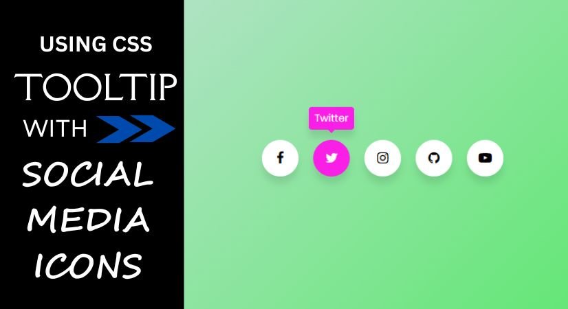
Tooltip Hover Effect on Social Media Icons using HTML & CSS
What is Tooltip?
A tooltip is a small, informative text box that shows up when a user hovers over, focuses on, or taps a specific element within a webpage or application. Its purpose is to offer extra detail or context regarding a feature, button, link, or any other interactive component without overwhelming the ingerface.
In this comprehensive guide, learn how to create CSS Social Media Icons with a Tooltip Hover Effect for popular platforms like Facebook, Instagram, Twitter, YouTube, and GitHub. Everything from the original design to the final execution is covered in this guide.
Over everyday lives depend depend heavily on social media, and businesses are using its power to reach their target audience more and more. Although it’s common practice to incorporate social media icons into websites or web applications, not everyone wants to rely on pre-made icons or third-party libraries. Pure CSS Social Media Icons come in handy in this situation.
- Step 1 : HTML CODE
To begin, we must first set up a simple HTML document. This document will contain the essential layout for our social media icons.
For the fundamental designs of the icons, we will utilize the free version of Font Awesome. There are various methods to incorporate Font Awesome files into your projects, but for this guide, I opted for the CDN approach.
Once you have created the files, simply insert the following code into your document. Remember to save your HTML file with a .html extension to ensure it displays correctly in a web browser.
<html>
  <head>
    <meta charset="UTF-8" />
    <title>Tooltip | Coding Jasim</title>
    <link rel="stylesheet" type="text/css" href="styles.css" />
    <link rel="stylesheet" href="https://cdnjs.cloudflare.com/ajax/libs/font-awesome/4.7.0/css/font-awesome.min.css">
  </head>
  <body>
  <div class="section">
  <div class="icon facebook">
      <div class="tooltip">Facebook</div>
      <span><i class="fa fa-facebook"></i></span>
  </div>
  <div class="icon twitter">
      <div class="tooltip">Twitter</div>
      <span><i class="fa fa-twitter"></i></span>
  </div>
  <div class="icon instagram">
      <div class="tooltip">Instagram</div>
      <span><i class="fa fa-instagram"></i></span>
  </div>
  <div class="icon github">
      <div class="tooltip">Github</div>
      <span><i class="fa fa-github"></i></span>
  </div>
  <div class="icon youtube">
      <div class="tooltip">YouTube</div>
      <span><i class="fa fa-youtube-play"></i></span>
  </div>
</div>
  </body>
</html>- Step 2 : CSS CODE
After establishing the fundamental HTML framework for the social media icons, the subsequent step to enhance their appearance through CSS. CSS enables us to dictate the visual design of the website, covering aspects such as layout, color schemes, and font styles. Additionally, we will incorporate padding and margin properties to guarantee that everything appears as intended.
@import url("https://fonts.googleapis.com/css2?family=Poppins&display=swap");
* {
margin: 0;
padding: 0;
box-sizing: border-box;
}

*:focus,
*:active {
outline: none !important;
-webkit-tap-highlight-color: transparent;
}

html,
body {
display: grid;
height: 100vh;
width: 100%;
font-family: "Poppins", sans-serif;
place-items: center;
background: linear-gradient(315deg, #3ae84b, #d7e1ec);
}

.section {
display: inline-flex;
}

.section .icon {
position: relative;
background: #ffffff;
border-radius: 50%;
padding: 15px;
margin: 10px;
width: 50px;
height: 50px;
font-size: 18px;
display: flex;
justify-content: center;
align-items: center;
flex-direction: column;
box-shadow: 0 10px 10px rgba(0, 0, 0, 0.1);
cursor: pointer;
transition: all 0.2s cubic-bezier(0.68, -0.55, 0.265, 1.55);
-webkit-border-radius: 50%;
-moz-border-radius: 50%;
-ms-border-radius: 50%;
-o-border-radius: 50%;
-webkit-transition: all 0.2s cubic-bezier(0.68, -0.55, 0.265, 1.55);
-moz-transition: all 0.2s cubic-bezier(0.68, -0.55, 0.265, 1.55);
-ms-transition: all 0.2s cubic-bezier(0.68, -0.55, 0.265, 1.55);
-o-transition: all 0.2s cubic-bezier(0.68, -0.55, 0.265, 1.55);
}

.section .tooltip {
position: absolute;
top: 0;
font-size: 14px;
background: #fff;
color: #ffffff;
padding: 5px 8px;
box-shadow: 0 10px 10px rgba(0, 0, 0, 0.1);
opacity: 0;
pointer-events: none;
border-radius: 4px;
transition: all 0.3s cubic-bezier(0.68, -0.55, 0.265, 1.55);
-webkit-transition: all 0.3s cubic-bezier(0.68, -0.55, 0.265, 1.55);
-moz-transition: all 0.3s cubic-bezier(0.68, -0.55, 0.265, 1.55);
-ms-transition: all 0.3s cubic-bezier(0.68, -0.55, 0.265, 1.55);
-o-transition: all 0.3s cubic-bezier(0.68, -0.55, 0.265, 1.55);
-webkit-border-radius: 4px;
-moz-border-radius: 4px;
-ms-border-radius: 4px;
-o-border-radius: 4px;
}

.section .tooltip::before {
position: absolute;
content: "";
height: 8px;
width: 8px;
background: #fff;
bottom: -3px;
left: 50%;
transform: translate(-50%) rotate(45deg);
transition: all 0.3s cubic-bezier(0.68, -0.55, 0.265, 1.55);
-webkit-transform: translate(-50%) rotate(45deg);
-moz-transform: translate(-50%) rotate(45deg);
-ms-transform: translate(-50%) rotate(45deg);
-o-transform: translate(-50%) rotate(45deg);
-webkit-transition: all 0.3s cubic-bezier(0.68, -0.55, 0.265, 1.55);
-moz-transition: all 0.3s cubic-bezier(0.68, -0.55, 0.265, 1.55);
-ms-transition: all 0.3s cubic-bezier(0.68, -0.55, 0.265, 1.55);
-o-transition: all 0.3s cubic-bezier(0.68, -0.55, 0.265, 1.55);
}

.section .icon:hover .tooltip {
top: -45px;
opacity: 1;
visibility: visible;
pointer-events: auto;
}

.section .icon:hover span,
.section .icon:hover .tooltip {
text-shadow: 0 -1px 0 rgba(0, 0, 0, 0.01);
}

.section .facebook:hover,
.section .facebook:hover .tooltip,
.section .facebook:hover .tooltip::before {
background: #1603e1;
color: #fff;
}

.section .twitter:hover,
.section .twitter:hover .tooltip,
.section .twitter:hover .tooltip::before {
background: #fa1fe7;
color: #fff;
}

.section .instagram:hover,
.section .instagram:hover .tooltip,
.section .instagram:hover .tooltip::before {
background: #9e0337;
color: #fff;
}

.section .github:hover,
.section .github:hover .tooltip,
.section .github:hover .tooltip::before {
background: #5a3333;
color: #fff;
}

.section .youtube:hover,
.section .youtube:hover .tooltip,
.section .youtube:hover .tooltip::before {
background: #f73b3b;
color: #fff;
}
Final Thoughts
This detailed guide has equipped you with the knowledge to design Social Media Icons using CSS featuring a Tooltip Hover Effect. These icons are not only lightweight and aesthetically pleasing but can also be customized to fit the design of your website or web application.
As you incorporate pure CSS Social Media Icons, remember to adhere to best practices for HTML and CSS. This involves utilizing semantic HTML, ensuring your CSS is neat and structured, and testing the icons across various devices and web browsers.