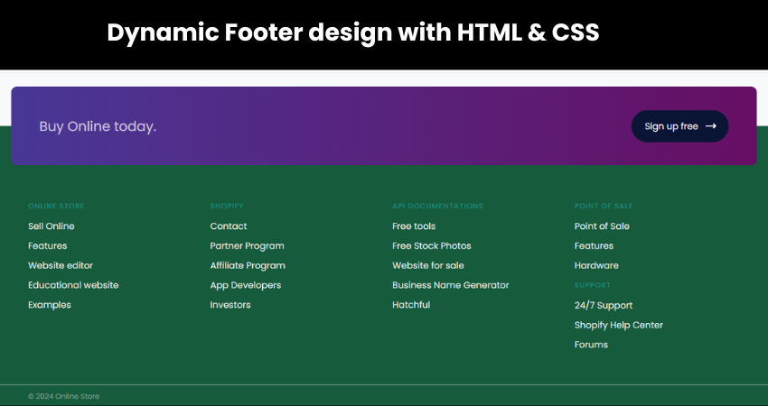
Responsive Footer design by using HTML & CSS
Master HTML and CSS to design a dynamic/responsive website footer. Enhance the visitors journey with our easy-to-follow instructions on crafting a mobile-optimized footer.
Welcome to in our in-depth tutorial on building a responsive footer with HTML and CSS. In the era of digital dominance, where smartphones are key to online exploration, a dynamic footer is no longer optional–it’s a must. A well-crafted footer ensures a smooth interaction, offering vital details and pathways.

In this tutorial, we’ll delve into the essential components of a responsive footer, examining the complexities of HTML and CSS to you assist in developing a footer that not only adjust to different screen dimensions but also improves your website’s visual appeal. Whether you’re an experienced coder or just beginning, this all-encompassing guide will provide you with the necessary knowledge and abilities to create a footer that makes a memorable impact.
Embark on this journey with us as we explore the technique of making a responsive footer that not only adheres technical requirements but also improves the user experience on your site. Let’s begin!
HTML Code
To begin, we’ll first need to draft a simple HTML document. Within this document, we’ll layout the fundamental framework for our footer.
After drafting the documents, simply copy and paste the provided codes into your document. Ensure to save your HTML document with the .html extension, ensuring it’s viewable in a web browser.
<!DOCTYPE html>
<html lang="en">
  <head>
    <meta charset="UTF-8" />
    <meta name="viewport" content="width=device-width, initial-scale=1.0" />
    <title>Footer Design 4 | Coding Jasim</title>
    <link rel="preconnect" href="https://fonts.googleapis.com" />
    <link rel="preconnect" href="https://fonts.gstatic.com" crossorigin />
    <link
      href="https://fonts.googleapis.com/css2?family=Poppins:wght@400;500;600&display=swap"
      rel="stylesheet"
    />
    <link
      rel="stylesheet"
      href="https://fonts.googleapis.com/css2?family=Material+Symbols+Outlined:opsz,wght,FILL,GRAD@24,400,0,0"
    />
    <!--<link rel="stylesheet" href="src/style.css" />-->
    <link rel="stylesheet" href="styles.css">
  </head>
  <body>
    <footer>
      <article>
        <h2>Buy Online today.</h2>
        <button>
          <p>Sign up free</p>
          <span class="material-symbols-outlined"> trending_flat </span>
        </button>
      </article>

      <section class="top">
        <ul>
          <li>
            <h3>Online Store</h3>
            <a>Sell Online</a>
            <a>Features</a>
            <a>Website editor</a>
            <a>Educational website</a>
            <a>Examples</a>
          </li>
          <li>
            <h3>Shopify</h3>
            <a>Contact</a>
            <a>Partner Program</a>
            <a>Affiliate Program</a>
            <a>App Developers</a>
            <a>Investors</a>
          </li>
          <li>
            <h3>API Documentations</h3>
            <a>Free tools</a>
            <a>Free Stock Photos</a>
            <a>Website for sale</a>
            <a>Business Name Generator</a>
            <a>Hatchful</a>
          </li>
          <li>
            <h3>Point of Sale</h3>
            <a>Point of Sale</a>
            <a>Features</a>
            <a>Hardware</a>
            <h3>Support</h3>
            <a>24/7 Support</a>
            <a>Shopify Help Center</a>
            <a>Forums</a>
          </li>
        </ul>
      </section>

      <section class="bottom">© 2024 Online Store</section>
    </footer>
  </body>
</html>
CSS Code
Following the establishment of the basic HTML structure for the footer, the subsequent phase involves applying styling to the footer through CSS.
Let’s we’ll develop our CSS file. Within this file, we’ll apply some fundamental CSS principles to design our footer.
body {
  background: #f8f9fb;
  font-family: "Euclid Circular A", "Poppins";
}

* {
  box-sizing: border-box;
}
footer {
  position: fixed;
  left: 0;
  bottom: 0;
  right: 0;
  padding-bottom: 20px;
  background: #175b3d;
  color: #f9f9f9;
}
footer article {
  display: flex;
  flex-direction: column;
  align-items: center;
  justify-content: space-between;
  gap: 16px;
  padding: 20px 50px 40px;
  margin: -99px 20px 20px;
  border-radius: 10px;
  background: linear-gradient(90deg, #493896, #670f64);
}
footer article h2 {
  font-weight: 400;
  color: rgb(255 255 255 / 70%);
}
footer article button {
  display: flex;
  align-items: center;
  justify-content: space-between;
  gap: 10px;
  padding: 0 40px 0 44px;
  width: 100%;
  background: #0a1536;
  border: 0;
  border-radius: 30px;
  color: #f9f9f9;
  font-family: inherit;
  font-size: 16px;
}
footer section {
  padding: 0 50px;
}
section.top {
  padding-top: 30px;
  margin-bottom: 48px;
}
section.top img {
  display: block;
  height: 30px;
  margin: 0 0 30px;
}
section.top ul {
  list-style: none;
  padding: 0;
  margin: 0;
  display: grid;
  gap: 30px;
  grid-template-columns: repeat(2, 1fr);
}

@media (width > 480px) {
  footer article button {
    width: 70%;
  }

  section.top ul {
    padding-right: 10%;
  }
}

@media (width > 600px) {
  footer article {
    flex-direction: row;
    min-height: 140px;
    margin: -70px 20px 20px;
    padding: 30px 50px 30px;
  }

  footer article button {
    width: auto;
    padding: 0 20px 0 24px;
  }

  section.top ul {
    grid-template-columns: repeat(4, 1fr);
    padding-right: 0;
  }
}

section.top ul li a {
  display: block;
  margin-bottom: 10px;
  color: rgb(255 255 255 / 90%);
}

section.top h3 {
  color: rgba(29, 203, 212, 0.4);
  font-weight: 500;
  text-transform: uppercase;
  font-size: 13px;
  letter-spacing: 1px;
}

section.bottom {
  padding-top: 10px;
  border-top: 2px solid rgba(255, 255, 255, 0.322);
  color: rgb(255 255 255 / 40%);
  font-size: 13px;
}
Conclusion
Well done! You’ve made it through our detailed tutorial on how to make a responsive footer with HTML and CSS. By this point, You should be fully equipped with the knowledge of why a responsive footer matters and the process to make one.
We’re grateful for your participations in this journey. We trust this tutorial has given you the confidence to not only make a responsive footer and also a lively and captivating one.


