

How to design Toast Alert message with HTML & CSS
What is meant by Toast Alert messages?
A toast alert is a small alert message that appear on a screen, typically on a computer or mobile device, to provide you with quick information. It may inform you that your download has finished, a new message has arrived, or that your battery is running low.
The expression “toast” originates from the way in which the alert pops up and disappear after a few seconds–similar to how a piece of toast pops out of a toaster. It does not disrupt your activities and vanishes automatically.
These alerts are quite beneficial in everyday life. Whether you are using WhatsApp, YouTube, or a banking application, toast alert messages discreetly keep you informed without requiring any action from you.
In this tutorial, we will explore the process of building toast notification with HTML and CSS. These essential web development technologies enables us to design straightforward but impactful notification pops up that can be effortlessly incorporated into any website or web application. Whether you are a novice or a seasoned developer aiming to improve your UI/UX design, this comprehensive guide will provide you with the tools necessary to effectively create personalized toast notification. Let’s dive in!
- HTML CODE
In this tutorial, To initiate the creation of a toast messages in HTML, start by establishing a container element that will hold the alert message.
<!DOCTYPE html>
<html lang="en">
<head>
<meta charset="UTF-8" />
<meta http-equiv="X-UA-Compatible" content="IE=edge" />
<meta name="viewport" content="width=device-width, initial-scale=1.0" />
<title>Toast Messages | Coding Jasim</title>
<link rel="stylesheet" href="styles.css" />
</head>
<body>
<div class="section">
<div class="toast-btns">
<input type="radio" name="btn-group" id="btn-success" checked />
<label for="btn-success">Success</label>
<input type="radio" name="btn-group" id="btn-info" />
<label for="btn-info">Info</label>
<input type="radio" name="btn-group" id="btn-pending" />
<label for="btn-pending">Pending</label>
<input type="radio" name="btn-group" id="btn-error" />
<label for="btn-error">Error</label>
</div>
<div class="toast-section">
<div class="toast" id="success">
<div class="toast-icon">
<svg>
<path d="M20 6 9 17l-5-5" />
</svg>
</div>
<div class="toast-msg">
<p>
Your installation is completed
<span>View Installation Details</span>
</p>
</div>
</div>
<div class="toast" id="info">
<div class="toast-icon">
<svg>
<path d="M12 2, L12 13" />
<path d="M12 17, L12 20" />
</svg>
</div>
<div class="toast-msg">
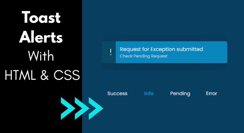
<p>
Request for Exception submitted
<span>Check Pending Request</span>
</p>
</div>
</div>
<div class="toast" id="pending">
<div class="toast-icon">
<svg>
<circle cx="12" cy="12" r="10" />
<path d="M12 6v6l4 2" />
</svg>
</div>
<div class="toast-msg">
<p>
Your update is currently being installed
<span>See Updates</span>
</p>
</div>
</div>
<div class="toast" id="error">
<div class="toast-icon">
<svg>
<path d="M18 6 6 18M6 6l12 12" />
</svg>
</div>
<div class="toast-msg">
<p>
Uninstallation Failed
<span>View More Details</span>
</p>
</div>
</div>
</div>
</div>
</body>
</html>- CSS CODE
In this tutorial, After setting up the fundamental HTML framework for the toast alert message, the subsequent step involves applying styles to the alert messages with CSS.
In this CSS file, we will implement some fundamental CSS rules to design our alert messages.
@import url("https://fonts.googleapis.com/css2?family=Poppins:ital,wght@0,100;0,200;0,300;0,400;0,500;0,600;0,700;0,800;0,900;1,100;1,200;1,300;1,400;1,500;1,600;1,700;1,800;1,900&display=swap");

* {
	margin: 0;
	padding: 0;
	box-sizing: border-box;
}

:root {
	--green: #0aa94a;
	--dark-green: #2a864f;
	--blue: #0986bb;
	--dark-blue: #0a4966;
	--grey: #af7dac;
	--dark-grey: #75787b;
	--red: #c11e1e;
	--dark-red: #501d1d;
	--bkg: #083e5f;
	--white: #ebebeb;
}

body {
	min-height: 100vh;
	display: grid;
	place-items: center;
	background-color: var(--bkg);
	font-family: "Poppins", sans-serif;
}

.section{
	width: 400px;
	height: 200px;
	position: relative;
}

/* Toast Notifications
------------------------------------------*/
.toast-section {
	position: absolute;
	top: 0;
	left: 50%;
	transform: translateX(-50%);
	width: 350px;
	height: 100px;
	overflow: hidden;
}

.toast {
	position: absolute;
	width: 350px;
	display: grid;
	grid-template-columns: 6vmin 1fr;
	align-items: center;
	border-radius: 5px;
	overflow: hidden;
	--padding: 0.8em;
	box-shadow: rgba(17, 17, 26, 0.1) 0px 8px 24px,
		rgba(17, 17, 26, 0.1) 0px 16px 56px, rgba(17, 17, 26, 0.1) 0px 24px 80px;
	opacity: 0;
	transform: translateY(120px);
	transition: transform 1500ms cubic-bezier(0.16, 0, 0, 1.42);
}

.toast:nth-child(1) .toast-msg {
	background-color: var(--green);
}
.toast:nth-child(1) .toast-icon {
	background-color: var(--dark-green);
}
.toast:nth-child(2) .toast-msg {
	background-color: var(--blue);
}
.toast:nth-child(2) .toast-icon {
	background-color: var(--dark-blue);
}
.toast:nth-child(3) .toast-msg {
	background-color: var(--grey);
	color: var(--bkg);
}
.toast:nth-child(3) .toast-icon {
	background-color: var(--dark-grey);
}
.toast:nth-child(4) .toast-msg {
	background-color: var(--red);
}
.toast:nth-child(4) .toast-icon {
	background-color: var(--dark-red);
}

.toast svg {
	width: 24px;
	height: 24px;
	fill: none;
	stroke: var(--white);
	stroke-width: 2;
}

.toast-icon {
	height: 100%;
	display: grid;
	place-items: center;
	padding: var(--padding);
}

.toast-msg {
	color: var(--white);
	font-size: 0.9rem;
	padding: var(--padding);
}
.toast-msg span {
	display: block;
	font-size: 0.7rem;
	opacity: 0.7;
}

/* Toast Buttons
------------------------------------------*/
.toast-btns {
	position: absolute;
	bottom: 10%;
	left: 50%;
	transform: translateX(-50%);
	width: 350px;
	display: flex;
}
.toast-btns input {
	appearance: none;
}
.toast-btns label {
	color: var(--white);
	text-align: center;
	flex: 1 100%;
	font-size: 0.85rem;
	padding: 0.3em;
	cursor: pointer;
}

.toast-btns:has(:checked) + .toast-section .toast {
	opacity: 0;
	transform: translateY(120px);
	transition: transform 1500ms cubic-bezier(0.16, 0, 0, 1.42);
}

.toast-btns:has(#btn-success:checked)
	+ .toast-section
	.toast[id="success"] {
	opacity: 1;
	transform: translateY(20px);
}
#btn-success:checked + label {
	color: var(--green);
	font-weight: bolder;
}
.toast-btns:has(#btn-info:checked) + .toast-section .toast[id="info"] {
	opacity: 1;
	transform: translateY(20px);
}
#btn-info:checked + label {
	color: var(--blue);
	font-weight: bolder;
}
.toast-btns:has(#btn-pending:checked)
	+ .toast-section
	.toast[id="pending"] {
	opacity: 1;
	transform: translateY(20px);
}
#btn-pending:checked + label {
	color: var(--dark-grey);
	font-weight: bolder;
}
.toast-btns:has(#btn-error:checked) + .toast-section .toast[id="error"] {
	opacity: 1;
	transform: translateY(20px);
}
#btn-error:checked + label {
	color: var(--red);
	font-weight: bolder;
}
Conclusion & Final Thoughts
In summary, gaining proficiency in crafting toast alert messages with HTML and CSS unlocks numerous opportunities to enhance user engagement and experience on your website or web application. By adhering to the steps described in this guide, you have learned how to organize HTML elements and style them with CSS to create custom toast alert messages that align with your design vision and user requirements.
Toast alerts provide a discreet yet effective method to convey essential information to users without interrupting their workflow. Whether your are informing users of successful actions, sharing updates, or signaling errors, integrating toast alerts enriches your web projects and fosters a seamless user experience.
Try out various features, animations, and designs to further customize and refine your toast alerts. Always seek input from users to enhance and improve the effectiveness of your alert messages over time. Begin implementing toast alerts now and elevate how you engage with your audience.