


How to create Landing page Clone of Netflix with HTML, CSS, and JavaScript
Developing a landing page clone for Netflix is an easy task. Which refers to a site or application designed to emulate the layout, functionalities, and features of Netflix’s Landing page. It is commonly utilized to highlight design abilities or to illustrate how a comparable platform can be constructed. The aim of a Landing Page clone is to deliver a user experience akin to the original, while possibly incorporating extra features or customization choices.
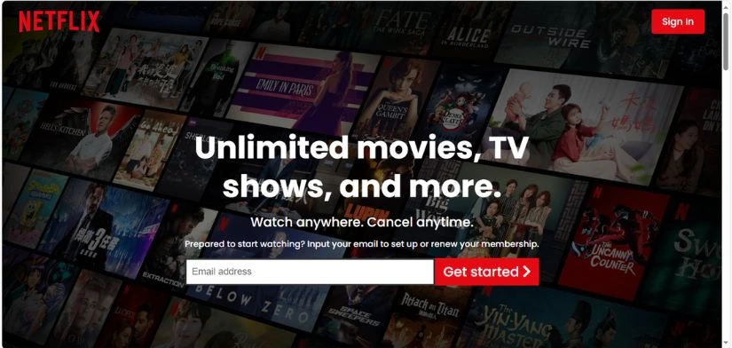
In this article, we will guide you through the process of creating a landing page that resembles those found on Netflix, complete with a banner image and content arrangement.
- Requirements
Before you embark on this tutorial, you should possess a fundamental understanding of HTML, CSS, and JavaScript. Furthermore, you will require a code editor like Visual Studio or Sublime Text to compose and store your code.
- HTML CODE
To begin, we must first set up a basic HTML file. This file will contain the fundamental layout for our Netflix landing page. Once file is created, just insert the following code snippets into your file. Be sure save your HTML document with a .html extension, as this will allow it to be correctly displayed in a web browser.
<!DOCTYPE html>
<!-- Created by Coding Jasim | www.codingjasimweb.com-->
<html lang="en">
  <head>
    <title>Netflix Landing Page | Coding Jasim</title>
    <meta charset="UTF-8" />
    <meta name="viewport" content="width=device-width" />
    <link rel="stylesheet" href="https://cdnjs.cloudflare.com/ajax/libs/font-awesome/5.15.2/css/all.min.css" />
    <link rel="stylesheet" href="styles.css" />
  </head>
  <body>
  <div class="outter-container">
  <!-- header section-->
  <header class="header-section">
    <nav class="logo">
      <img src="https://images.ctfassets.net/y2ske730sjqp/821Wg4N9hJD8vs5FBcCGg/9eaf66123397cc61be14e40174123c40/Vector__3_.svg?w=460" alt="Netflix" />
      <a href="" class="btn"> Sign In</a>
    </nav>

    <div class="inner-section">
      <div class="inner-title">
        <h1>Unlimited movies, TV shows, and more.</h1>
      </div>
      <div class="inner-text">
        <p>Watch anywhere. Cancel anytime.</p>
      </div>

      <div class="email-form">
        <p>
          Prepared to start watching? Input your email to set up or renew your
          membership.
        </p>

        <div class="get-started">
          <input type="text" name="" id="" placeholder="Email address" />
          <a href="" class="btn-lg"
            >Get started <i class="fas fa-chevron-right"></i
          ></a>
        </div>
      </div>
    </div>
    <div class="overlay"></div>
  </header>
  <!-- showcase1 -->
  <section class="showcase">
    <div class="showcase-section case1">
      <div class="inner-section">
        <div class="inner-title">
          <h1>Enjoy on your TV.</h1>
        </div>
        <div class="inner-text">
          <p>
            Enjoy your viewing experience on Smart TVs, PlayStation, Xbox, Chromecast, Apple TV,
            Blu-ray players, and more.
          </p>
        </div>
      </div>
      <div class="showcase-img">
        <img
          src="https://assets.nflxext.com/ffe/siteui/acquisition/ourStory/fuji/desktop/tv.png"
          alt=""
        />
        <video class="showcase-animation" autoplay playsinline muted loop>
          <source
            src="https://assets.nflxext.com/ffe/siteui/acquisition/ourStory/fuji/desktop/video-tv-0819.m4v"
            type="video/mp4"
          />
        </video>
      </div>
    </div>
  </section>
  <!-- showcase 2 -->
  <section class="showcase">
    <div class="showcase-section case2">
      <div class="showcase-img">
        <img
          src="https://assets.nflxext.com/ffe/siteui/acquisition/ourStory/fuji/desktop/mobile-0819.jpg"
          alt=""
        />
        <div class="downloading">
          <img
            src="https://assets.nflxext.com/ffe/siteui/acquisition/ourStory/fuji/desktop/boxshot.png"
            alt=""
          />
          <div class="download-text">
            <h1>Stranger Things</h1>
            <p>Downloading...</p>
          </div>
        </div>
      </div>
      <div class="inner-section">
        <div class="inner-title">
          <h1>Download your shows to watch offline.</h1>
        </div>
        <div class="inner-text">
          <p>
            Easily save your favorite content and always have something ready to watch.
          </p>
        </div>
      </div>
    </div>
  </section>
  <!-- showcase3 -->
  <section class="showcase">
    <div class="showcase-section case3">
      <div class="inner-section">
        <div class="inner-title">
          <h1>Watch everywhere.</h1>
        </div>
        <div class="inner-text">
          <p>
            Access unlimited films and TV series on your smartphone, tablet,
            laptop, and television without any additional charges.
          </p>
        </div>
      </div>
      <div class="showcase-img">
        <img
          src="https://assets.nflxext.com/ffe/siteui/acquisition/ourStory/fuji/desktop/device-pile.png"
          alt=""
        />
        <video class="showcase-animation" autoplay playsinline muted loop>
          <source
            src="https://assets.nflxext.com/ffe/siteui/acquisition/ourStory/fuji/desktop/video-devices.m4v"
            type="video/mp4"
          />
        </video>
      </div>
    </div>
  </section>
  <!-- faq list -->
  <section class="faq">
    <div class="inner-section">
      <div class="inner-title">
        <h1>Frequently Asked Questions</h1>
      </div>

      <ul>
        <li>
          <h2>What is Netflix <i class="fas fa-plus"></i></h2>
          <p>
            Netflix is a streaming platform providing a broad range of award
            -winning TV series, movies, anime, documentaries, and more across
            thousands of internet-enabled devices. <br />You can enjoy as much
            content as you like, whenever you wish, without any
            advertisements – all for one affordable monthly fee. There’s always something
            new to explore, with new TV shows and films added weekly!
          </p>
        </li>
        <li>
          <h2>How much does NetFlix cost? <i class="fas fa-plus"></i></h2>
          <p>
            Stream Netflix on your smartphone, tablet, Smart TV, laptop, or
            streaming device, all for one set monthly cost. <br />
             Subscription plans vary from TWD270 to TWD390 per month.
            No hidden fees, no commitments.
          </p>
        </li>
        <li>
          <h2>Where can I watch?<i class="fas fa-plus"></i></h2>
          <p>
            Watch anytime, anywhere, on an unlimited number of devices. Log in
            with your Netflix account to instantly stream on the web at
            netflix.com from your personal computer or any internet-connected
            device that supports the Netflix app, including smart TVs,
            smartphones, tablets, streaming media players, and gaming
            consoles. <br />You can also download your preferred shows using
            the iOS, Android, or Windows 10 app. Utilize downloads to enjoy
            content while traveling and without internet access. Carry Netflix
            with you wherever you go.
          </p>
        </li>
        <li>
          <h2>How do I cancel?<i class="fas fa-plus"></i></h2>
          <p>
            Netflix is flexible. There are no pesky contracts and no
            commitments. You can easily cancel your account online in two
            clicks. There are no cancellation fees – start or stop your
            account anytime.
          </p>
        </li>
        <li>
          <h2>What can I watch on Netflix?<i class="fas fa-plus"></i></h2>
          <p>
            Netflix offers a vast collection of movies, documentaries,
            series, anime, acclaimed Netflix originals, and much more.
            Enjoy unlimited viewing whenever you desire, at any time you
          </p>
        </li>
      </ul>

      <div class="email-form">
        <p>
          Ready to watch? Enter your email to create or restart your
          membership.
        </p>

        <div class="get-started">
          <input type="text" name="" id="" placeholder="Email address" />
          <a href="" class="btn-lg"
            >Get started <i class="fas fa-chevron-right"></i
          ></a>
        </div>
      </div>
    </div>
  </section>
  <!-- footer -->
  <footer>
    <p>Questions? Contact us.</p>
    <div class="links">
      <ul>
        <li>FAQ</li>
        <li>Help Center</li>
        <li>Account</li>
        <li>Media Center</li>
        <li>Investor Relations</li>
        <li>Jobs</li>
        <li>Ways to Watch</li>
        <li>Terms of Use</li>
        <li>Privacy</li>
        <li>Cookie Preferences</li>
        <li>Corporate Information</li>
        <li>Contact Us</li>
        <li>Speed Test</li>
        <li>Legal Notices</li>
        <li>Netflix Originals</li>
      </ul>
      <p>NetFlix Taiwan</p>
      <div class="language" id="btn-language">
        <i class="fas fa-globe"></i> English
        <i class="fas fa-sort-down lg"></i>
        <div class="dropdown-list">
          <ul class="" id="language-dropdown">
            <li>中文</li>
            <li>English</li>
          </ul>
        </div>
      </div>
    </div>
  </footer>
</div>
<script src="script.js"></script>
  </body>
</html>- CSS CODE
Once the fundamental HTML framework of Netflix landing page is established, the subsequent step to incorporate styling into the landing page using CSS, which enables us to manage the visual elements of the website, including aspects such as layout, color schemes, and font styles.
Also we’ll implement some basic CSS rules to enhance the appearance of our landing page. We will also include padding and margin properties to ensure everything is visually appealing. Create a CSS file with titles styles.css and insert the provided code into your CSS file. Don’t forget to use the .css extension when creating the file.
@import url('https://fonts.googleapis.com/css2?family=Poppins:wght@200;300;400;500;600;700&display=swap');
/* global setting */
* {
  box-sizing: border-box;
  margin: 0;
  padding: 0;
}

body {
  background: #000;
  color: #fff;
  font-weight: 500;
  font-family: "Poppins", sans-serif;
}

ul {
  list-style: none;
}

.lg {
  font-size: 1.5rem;
}

/* button style */
.btn {
  text-decoration: none;
  color: #fff;
  padding: 10px 20px;
  background: #e50914;
  border-radius: 5px;
  font-size: 1.1rem;
  text-align: center;
}

.btn-lg {
  text-decoration: none;
  color: #fff;
  padding: 10px 15px;
  margin: 0;
  background: #e50914;
  border-radius: 5px;
  font-size: 25px;
  text-align: center;
}

.btn-lg:hover {
  background: #fd1c27;
}

/* inner container title and text style */

.inner-section {
  display: flex;
  flex-direction: column;
  align-items: center;
  justify-content: center;
  position: relative;
  z-index: 1;
  line-height: 1.25;
}
.inner-title {
  font-size: 1.8rem;
  width: 90%;
}

.inner-title h1 {
  margin-bottom: 1rem;
}

.inner-text {
  font-size: 1.5rem;
  width: 90%;
}

/* email form */

.email-form {
  margin: 1rem;
}
.email-form .get-started {
  padding-top: 1rem;
  display: flex;
  height: 80%;
}

.email-form .get-started > input {
  border-radius: 2px 0 0 2px;
  border: 3px solid #333;
  padding-left: 10px;
  font-size: 1.1rem;
  outline: none;
  flex: 1;
}

.email-form .btn-lg {
  border-radius: 0 2px 2px 0;
}

/* header section */
.header-section {
  height: 110vh;
  position: relative;
  background: url("https://assets.nflxext.com/ffe/siteui/vlv3/8ef88e03-6f89-4c75-ae51-f8da7d252358/6ac07e5f-07ca-4543-8540-f22edce8bb02/TW-en-20210208-popsignuptwoweeks-perspective_alpha_website_medium.jpg")
  no-repeat center center/cover;
  box-shadow: inset 0 50px 300px #000, inset 0 -50px 300px #000;
  border-bottom: 10px #800606 solid;
}

/* brightness and vignette effect*/
.overlay {
  height: 100%;
  width: 100%;
  background: #000;
  position: absolute;
  left: 0;
  top: 0;
  opacity: 0.4;
}

/* logo */

.logo {
  display: flex;
  align-items: center;
  justify-content: space-between;
  padding: 1rem 2rem;
  position: relative;
  z-index: 1;
}

.logo > img {
  width: 150px;
}

/* header section text , input form and button*/

.header-section .inner-section {
  margin-top: 10rem;
}

.header-section .inner-title {
  width: 50%;
  text-align: center;
}

.header-section h1 {
  margin-bottom: 1rem;
}

.header-section .inner-text {
  width: 50%;
  text-align: center;
}

/* showcase 1 */

.showcase {
  border-bottom: 10px solid #333;
  padding: 2rem 0;
}
.showcase-section {
  display: flex;
  width: 85%;
  margin: auto;
}

.showcase-img {
  position: relative;
  z-index: 1;
}

.showcase-animation {
  position: absolute;
  left: 75px;
  top: 95px;
  z-index: -1;
}

/* showcase 2*/

.case2 {
  width: 90%;
}

.showcase-section.case2 > .showcase-img {
  margin: 1.2rem 0;
}

.downloading {
  background: #000;
  width: 60%;
  height: 125px;
  position: absolute;
  top: 335px;
  left: 125px;
  border: 5px solid #333;
  border-radius: 10px;
  padding: 0.7rem;
  display: flex;
}

.downloading > img {
  height: 100%;
}

.download-text {
  padding: 0.5rem;
  display: flex;
  flex-direction: column;
  justify-content: center;
}

.download-text > p {
  color: #0066e3;
}

/* showcase 3*/

.case3 .showcase-animation {
  width: 395px;
  height: 225px;
  top: 50px;
  left: 120px;
}

/* faq list */
.faq {
  border-bottom: 10px solid #333;
}

.faq .inner-section {
  line-height: 1.5;
  margin: 2rem 0;
}

.faq .inner-title {
  text-align: center;
}
.faq h1 {
  margin-bottom: 5rem;
}

.faq h2 {
  display: flex;
  justify-content: space-between;
  padding: 1.5rem;
}

.faq ul {
  width: 60%;
  margin: auto;
}

.faq li {
  border-bottom: 5px solid #000;
  background: #333;
  cursor: pointer;
}

.faq li.show i {
  transform: rotate(45deg);
}

.faq li > p {
  padding: 1rem 0;
  border-top: 1px solid #000;
  padding: 1.5rem;
  font-size: 1.3rem;
  position: absolute;
  max-height: 0;
  visibility: hidden;
  transition: max-height 0.1s ease-in;
}

.faq .inner-text {
  margin-top: 2rem;
}

/* show list item */
.faq li.show p {
  max-height: 700px;
  position: relative;
  visibility: visible;
}

/* footer */

footer {
  color: #757575;
  margin: 3rem auto;
  width: 70%;
}

footer .links > * {
  margin-bottom: 20px;
}

footer p {
  margin-bottom: 2rem;
}

footer .links ul {
  display: grid;
  grid-template-columns: repeat(4, 1fr);
  grid-gap: 1rem;
}

footer .language {
  padding: 1rem 0;
  font-weight: 700;
  cursor: pointer;
  width: 14%;
  border: 1px solid #333;
  border-radius: 0.2rem;
  font-family: inherit;
  padding: 1rem;
  position: relative;
}

footer .language:active {
  outline: 1px solid #fff;
  box-shadow: 0 0 0 2px #fff;
}

footer .dropdown-list {
  width: 100%;
}

footer .dropdown-list ul {
  display: none;
  position: absolute;
  background: #000;
  border: 1px solid #333;
  top: 58px;
  width: 100%;
  left: 0;
}

footer .dropdown-list li {
  margin: 0.5rem 0;
}

/* show dropdown item */
footer .dropdown-list ul.show {
  display: block;
}

/* large-screen*/

@media (max-width: 950px) {
  /* global setting */

  /* button */
  .btn-lg {
    padding: 10px 12.5px;
    font-size: 15px;
    text-align: center;
    margin: 10px auto;
  }

  /* text style */

  .inner-title {
    font-size: 1.6rem;
    text-align: center;
    width: 100%;
  }

  .inner-text {
    font-size: 1.2rem;
    width: 100%;
    text-align: center;
  }

  /* email form */
  .email-form .get-started {
    padding-top: 1rem;
    display: flex;
    flex-direction: column;
  }

  .email-form .get-started > input {
    padding: 1rem;
    font-size: 1.1rem;
  }

  /* nav logo */
  .logo > img {
    width: 120px;
  }

  /* header section*/
  .header-section {
    height: 100%;
  }

  .header-section .inner-title {
    width: 70%;
  }

  /* showcase section*/
  .showcase-section {
    flex-direction: column;
    width: 90%;
  }

  .showcase-img {
    display: flex;
    justify-content: center;
  }

  .showcase-animation {
    left: 180px;
    top: 95px;
    z-index: -1;
  }

  .case2 .showcase-img {
    order: 2;
  }

  .case3 .showcase-animation {
    top: 50px;
    left: 218px;
  }

  /* faq list */
  .faq ul {
    width: 90%;
    margin: auto;
  }

  .faq h2 {
    display: flex;
    justify-content: space-between;
    padding: 0.5rem 1rem;
    font-size: 1.2rem;
  }

  /* footer */
  footer {
    width: 90%;
  }

  footer .language {
    width: 20%;
  }
}

/* tablet-screen */
@media (max-width: 768px) {
  .header-section .inner-section {
    margin-top: 2rem;
  }

  .inner-title {
    width: 90%;
    font-size: 1.5rem;
  }

  .inner-text {
    width: 90%;
    font-size: 1.5rem;
  }
  .case1 .showcase-animation {
    left: 100px;
  }

  .case3 .showcase-animation {
    left: 135px;
  }
  /* button */

  .btn {
    padding: 10px 15px;
    font-size: 15px;
  }
}

/* median-screen*/
@media (max-width: 550px) {
  /* nav logo */

  .logo > img {
    width: 100px;
  }

  /* showcase*/
  .inner-text .get-started > input {
    padding: 0.5rem;
    font-size: 1.1rem;
  }
  .showcase-img {
    display: flex;
    justify-content: center;
  }

  .showcase-img > img {
    width: 100%;
  }

  .case1 .showcase-animation {
    width: 400px;
    left: 35px;
    top: 45px;
  }

  .case3 .showcase-animation {
    width: 300px;
    top: 0;
    left: 85px;
  }

  .downloading {
    top: 260px;
    left: 95px;
    height: 70px;
    border: 3px solid #333;
  }

  .download-text {
    font-size: 10px;
    padding-left: 15px;
  }

  /* faq list */
  .faq h1 {
    text-align: center;
    font-size: 25px;
    margin-bottom: 0.5rem;
  }

  .faq ul {
    width: 100%;
  }
  .faq li {
    font-size: 10px;
  }

  /* footer */
  footer .links ul {
    grid-template-columns: repeat(2, 1fr);
    grid-gap: 1rem;
  }
}

@media (max-width: 375px) {
  .inner-title {
    font-size: 1rem;
  }
  .inner-text {
    font-size: 1rem;
  }

  /* header section*/

  .header-section .inner-title {
    width: 90%;
  }
  .header-section .inner-text {
    width: 90%;
  }
  /* showcase */
  .case1 .showcase-animation {
    width: 250px;
    left: 45px;
    top: 50px;
  }

  .case3 .showcase-animation {
    width: 210px;
    left: 60px;
    top: -25px;
  }
  .downloading {
    top: 180px;
    left: 66px;
  }
}- JavaScript CODE
Now we need to use JavaScript to provide a dropdown functionality. Make a JavaScript file called script.js, then insert the given codes into it. Keep in mind that a file with the .js suffix must be created.
const languageDropdown = document.getElementById("btn-language")
const faqListItem = document.querySelectorAll(".inner-section ul li")

languageDropdown.addEventListener("click", () => {
  document.getElementById("language-dropdown").classList.toggle("show")
})

faqListItem.forEach((item) => {
  item.addEventListener("click", (e) => {
    item.classList.toggle("show")
  })
})
Conclusion & Final Thoughts
To summarize, crafting a clone of the Netflix landing page is an easy and swift process that can be completed in a just few steps. By adhering to the instructions presented in this tutorial, even beginner in web development can design an impressive landing page in mere minutes. Be sure to select an appropriate template, customize it to your preferences, and incorporate your own unique content to make it distinctive. With practice and exploration, you can create a landing page that closely resembles the original.