Complete Responsive Footer with HTML & CSS
In this post, you’ll discover how to craft a Completely Responsive Footer Section using HTML & CSS. In a previous post, I showed you how to create Bootstrap Footer Layout and Dynamic Footer Design by using HTML and CSS.
You might have noticed a footer on every website you’ve visited, as having a footer on a website is now a must. Typically, the footer appears at the bottom of the main page or near the end. The latest HTML5 update has added a dedicated for the footer, named <footer>

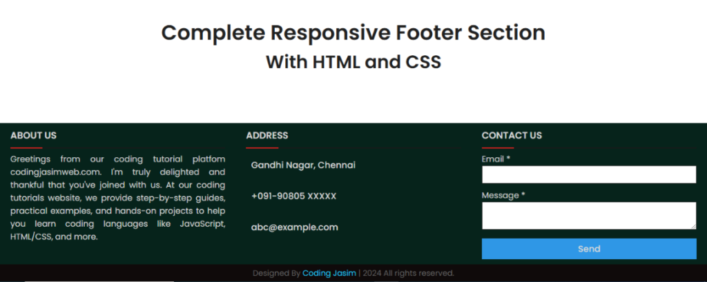
In the preview image as you seen of our footer design, there are various section of the footer like brief description, location details and a contact form. This footer is designed to be fully responsive across all devices, including smartphones. On desktop, these footer sections are laid out horizontally, but on smaller devices like smartphones, each section of the footer laid out vertically, automatically adjusting its size and position to fit the screen’s dimensions.
You can implement this adaptable footer code on your website or project after making a few adjustments to suit your needs, and you can also enhance this footer design to elevate its level. If you’re impressed with this footer and wish to obtain the source codes, it’s straightforward to copy the codes from the provided snippets or to download the source files of this footer layout. I’m confident that this adaptable footer code will assist in gaining a comprehensive understanding of CSS.
HTML Code
To develop this footer section, you’ll need to create two files: an HTML file named index.html and a CSS file named style.css. After these files are ready, simply insert the provided codes into them. Alternatively, you can download the source code files of this responsive footer design by clicking the download button below.
Begin by creating an HTML file titled index.html and insert the provided codes into it. Ensure the file ends with the .html extension.
<!DOCTYPE html>
<html lang="en" dir="ltr">
  <head>
    <meta charset="utf-8">
    <title>Responsive Footer Design - Coding Jasim</title>
    <link rel="stylesheet" href="style.css">
    <script src="https://kit.fontawesome.com/a076d05399.js"></script>
    <meta name="viewport" content="width=device-width, initial-scale=1.0">
  </head>
  <body>
    <div class="content1">
      <div class="text">Complete Responsive Footer Section</div>
      <div class="p">With HTML and CSS</div>
    </div>
    <footer>
      <div class="main-content">
        <div class="left box">
          <h2>About us</h2>
          <div class="content">
            <p>Greetings from our coding tutorial platfom codingjasimweb.com. I'm truly delighted and thankful that you've joined with us. At our coding tutorials website, we provide step-by-step guides, practical examples, and hands-on projects to help you learn coding languages like JavaScript, HTML/CSS, and more.</p>
          </div>
        </div>

        <div class="center box">
          <h2>Address</h2>
          <div class="content">
            <div class="place">
              <span class="fas fa-map-marker-alt"></span>
              <span class="text">Gandhi Nagar, Chennai</span>
            </div>
            <div class="phone">
              <span class="fas fa-phone-alt"></span>
              <span class="text">+091-90805 XXXXX</span>
            </div>
            <div class="email">
              <span class="fas fa-envelope"></span>
              <span class="text">abc@example.com</span>
            </div>
          </div>
        </div>

        <div class="right box">
          <h2>Contact us</h2>
          <div class="content">
            <form action="#">
              <div class="email">
                <div class="text1">Email *</div>
                <input type="email" required>
              </div>
              <div class="msg">
                <div class="text1">Message *</div>
                <textarea rows="2" cols="25" required></textarea>
              </div>
              <div class="btn">
                <button type="submit">Send</button>
              </div>
            </form>
          </div>
        </div>
      </div>
      <div class="bottom">
        <center>
          <span class="credit">Designed By <a href="https://www.codingjasimweb.com">Coding Jasim</a> | </span>
          <span class="far fa-copyright"></span><span> 2024 All rights reserved.</span>
        </center>
      </div>
    </footer>

  </body>
</html>
CSS Code
Next, create a CSS file titled style.css and insert the provided codes into it. Ensure the file ends with the .css extension.
@import url('https://fonts.googleapis.com/css?family=Poppins:400,500,600,700&display=swap');
*{
  margin: 0;
  padding: 0;
  color: #d9d9d9;
  box-sizing: border-box;
  font-family: 'Poppins', sans-serif;
}
.content1{
  position: relative;
  margin: 130px auto;
  text-align: center;
  padding: 0 20px;
}
.content1 .text{
  font-size: 2.5rem;
  font-weight: 600;
  color: #202020;
}
.content1 .p{
  font-size: 2.1875rem;
  font-weight: 600;
  color: #202020;
}
footer{
  position: fixed;
  bottom: 0px;
  width: 100%;
  background: #06231b;
}
.main-content{
  display: flex;
}
.main-content .box{
  flex-basis: 50%;
  padding: 10px 20px;
}
.box h2{
  font-size: 1.125rem;
  font-weight: 600;
  text-transform: uppercase;
}
.box .content{
  margin: 20px 0 0 0;
  position: relative;
}
.box .content:before{
  position: absolute;
  content: '';
  top: -10px;
  height: 2px;
  width: 100%;
  background: #1a1a1a;
}
.box .content:after{
  position: absolute;
  content: '';
  height: 2px;
  width: 15%;
  background: #f12020;
  top: -10px;
}
.left .content p{
  text-align: justify;
}
.left .content .social{
  margin: 20px 0 0 0;
}
.left .content .social a{
  padding: 0 2px;
}
.left .content .social a span{
  height: 40px;
  width: 40px;
  background: #1d1b1b;
  line-height: 40px;
  text-align: center;
  font-size: 18px;
  border-radius: 5px;
  transition: 0.3s;
}
.left .content .social a span:hover{
  background: #f12020;
}
.center .content .fas{
  font-size: 1.4375rem;
  background: #805454;
  height: 45px;
  width: 45px;
  line-height: 45px;
  text-align: center;
  border-radius: 50%;
  transition: 0.3s;
  cursor: pointer;
}
.center .content .fas:hover{
  background: #f12020;
}
.center .content .text{
  font-size: 1.0625rem;
  font-weight: 500;
  padding-left: 10px;
}
.center .content .phone{
  margin: 15px 0;
}
.right form .text{
  font-size: 1.0625rem;
  margin-bottom: 2px;
  color: #fefefe;
}
.right form .msg{
  margin-top: 10px;
}
.right form input, .right form textarea{
  width: 100%;
  font-size: 1.0625rem;
  color: black;
  padding-left: 10px;
  border: 1px solid #222222;
}
.right form input:focus,
.right form textarea:focus{
  outline-color: #3498db;
}
.right form input{
  height: 35px;
}
.right form .btn{
  margin-top: 10px;
}
.right form .btn button{
  height: 40px;
  width: 100%;
  border: none;
  outline: none;
  background: #2f97e6;
  font-size: 1.0625rem;
  font-weight: 500;
  cursor: pointer;
  transition: .3s;
}
.right form .btn button:hover{
  background: #ad1c1c;
}
.bottom center{
  padding: 5px;
  font-size: 0.9375rem;
  background: #0f0a0a;
}
.bottom center span{
  color: #656565;
}
.bottom center a{
  color: #20c7f1;
  text-decoration: none;
}
.bottom center a:hover{
  text-decoration: underline;
}
@media screen and (max-width: 900px) {
  footer{
    position: relative;
    bottom: 0px;
  }
  .main-content{
    flex-wrap: wrap;
    flex-direction: column;
  }
  .main-content .box{
    margin: 5px 0;
  }
}
That’s it, you’ve effectively created a Responsive Footer Section design utilizing HTML & CSS. if your code faces any problems or errors, or if you require additional help, please click the download button to obtain the source code files. The download will be in a .zip format, which you will need to unzip.


