

Animation on Button click by using HTML CSS & JavaScript
In contemporary web and mobile applications, animations serves a crucial function in enhancing user experience. A prevalent and effective method is the animation that occurs when a button is clicked. This contributes to creating a more interactive, visually engaging, and user-friendly interface.
Developing animation on a button-click using HTML, CSS, and JavaScript can be both a demanding and gratifying educational project. This project provides an excellent chance to refine your animation skills while creating something sharable with others.
Animation on a button-click is an animation that is triggered when a user clicks on a button. These animation can manifest in different ways, including altering the button’s color, resizing it, or producing a ripple effect. This animation enhance the interactivity and engagement of websites and web applications.
- Project Folder
To build this animation, first create a folder with your own. Inside this folder you have to create three files index.html, style.css, and script.js. Let’s begin by establishing these files and incorporating the fundamental code.
- HTML CODE
In the index.html file, insert the following HTML code to establish the basic framework for our button.
<!DOCTYPE html>
<html lang="en">
<head>
<meta charset="UTF-8" />
<meta http-equiv="X-UA-Compatible" content="IE=edge" />
<meta name="viewport" content="width=device-width, initial-scale=1.0" />
<title>Animation on Button click</title>
<link rel="stylesheet" href="style.css" />
</head>
<body>
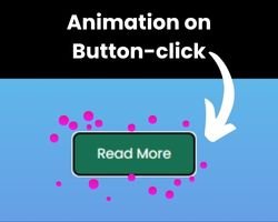
<button class="button">Read More</button>
</body>
</html>- CSS CODE
In the style.css file, include the following CSS code to apply styles and create the button along with its bubbles. Feel free to modify the color, font, background, and dimensions of the button within this code.
/* Import Google font - Poppins */
@import url("https://fonts.googleapis.com/css2?family=Poppins:wght@200;300;400;500;600;700&display=swap");
* {
  margin: 0;
  padding: 0;
  box-sizing: border-box;
  font-family: "Poppins", sans-serif;
}
body {
  display: flex;
  height: 100vh;
  display: flex;
  align-items: center;
  justify-content: center;
  background: linear-gradient(#52e2f1, #7573df);

}

.button {
  position: relative;
  padding: 10px 22px;
  border-radius: 6px;
  border: none;
  color: #fff;
  cursor: pointer;
  background-color: #187052;
  transition: all 0.2s ease;
}
.button:active {
  transform: scale(0.96);
}
.button:before,
.button:after {
  position: absolute;
  content: "";
  width: 150%;
  left: 50%;
  height: 100%;
  transform: translateX(-50%);
  z-index: -1000;
  background-repeat: no-repeat;
}
.button.animate::before {
  top: -70%;
  background-image: radial-gradient(circle, #f833ee 20%, transparent 20%),
    radial-gradient(circle, transparent 20%, #f833ee 20%, transparent 30%),
    radial-gradient(circle, #f833ee 20%, transparent 20%),
    radial-gradient(circle, #f833ee 20%, transparent 20%),
    radial-gradient(circle, transparent 10%, #f833ee 15%, transparent 20%),
    radial-gradient(circle, #f833ee 20%, transparent 20%),
    radial-gradient(circle, #f833ee 20%, transparent 20%),
    radial-gradient(circle, #f833ee 20%, transparent 20%),
    radial-gradient(circle, #f833ee 20%, transparent 20%);
  background-size: 10% 10%, 20% 20%, 15% 15%, 20% 20%, 18% 18%, 10% 10%, 15% 15%,
    10% 10%, 18% 18%;
  animation: pinktopBubbles ease-in-out 0.8s forwards infinite;
}
@keyframes pinktopBubbles {
  0% {
    background-position: 5% 90%, 10% 90%, 10% 90%, 15% 90%, 25% 90%, 25% 90%,
      40% 90%, 55% 90%, 70% 90%;
  }
  50% {
    background-position: 0% 80%, 0% 20%, 10% 40%, 20% 0%, 30% 30%, 22% 50%,
      50% 50%, 65% 20%, 90% 30%;
  }
  100% {
    background-position: 0% 70%, 0% 10%, 10% 30%, 20% -10%, 30% 20%, 22% 40%,
      50% 40%, 65% 10%, 90% 20%;
    background-size: 0% 0%, 0% 0%, 0% 0%, 0% 0%, 0% 0%, 0% 0%;
  }
}
.button.animate::after {
  bottom: -70%;
  background-image: radial-gradient(circle, #f833ee 20%, transparent 20%),
    radial-gradient(circle, #f833ee 20%, transparent 20%),
    radial-gradient(circle, transparent 10%, #f833ee 15%, transparent 20%),
    radial-gradient(circle, #f833ee 20%, transparent 20%),
    radial-gradient(circle, #f833ee 20%, transparent 20%),
    radial-gradient(circle, #f833ee 20%, transparent 20%),
    radial-gradient(circle, #f833ee 20%, transparent 20%);

  background-size: 15% 15%, 20% 20%, 18% 18%, 20% 20%, 15% 15%, 20% 20%, 18% 18%;
  animation: pinkbottomBubbles ease-in-out 0.8s forwards infinite;
}
@keyframes pinkbottomBubbles {
  0% {
    background-position: 10% -10%, 30% 10%, 55% -10%, 70% -10%, 85% -10%,
      70% -10%, 70% 0%;
  }
  50% {
    background-position: 0% 80%, 20% 80%, 45% 60%, 60% 100%, 75% 70%, 95% 60%,
      105% 0%;
  }
  100% {
    background-position: 0% 90%, 20% 90%, 45% 70%, 60% 110%, 75% 80%, 95% 70%,
      110% 10%;
    background-size: 0% 0%, 0% 0%, 0% 0%, 0% 0%, 0% 0%, 0% 0%;
  }
}- JAVASCRIPT
Once the user interface and it’s styling finalized, we will utilize JavaScript to create animations triggered by button clicks.
const button = document.querySelector(".button");

      button.addEventListener("click", (e) => {
        e.preventDefault;
        button.classList.add("animate");
        setTimeout(() => {
          button.classList.remove("animate");
        }, 600);
      });
Conclusion & Final Thoughts
You’ve successfully made a animation on button-click by following the instructions. This website offers a animation skills to help you improve your animation abilities.
If this blog is useful to you, please think about sharing with others. We are able to keep creating valuable content and resources for the development community.